The World is an Average
Michael Konrad

The simple average

An average is a concept that all of us are familiar with, and most have computed averages at school or work. An average is a single number which summarizes the a group of numbers. Some standard notation will help us as we expand the definition and uses of averages. Let A be the average of N data values, represented by the x's in the formula on the right. Each x is identified by a subscript, i. To get the common average we add all the N x's and divide by N (or multiply by 1/N, which is the same thing). The large Greek S stands for addition (or summing), and the initial and final values of i, the index, are indicated above and below the large Greek S.
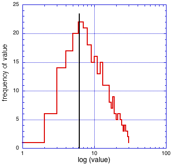
There are two typical reasons for computing an average. First, we may want a characterization of a group, i.e a single number that represents this group. This average would seem like a good way to do this (but there are other parameters, the mode or median, that can be better in some situations, see your statistics textbook).

A very different motivation is to overcome a limitation in the accuracy of a measurement. You might have a piston from a car engine and want to measure the diameter as accurately as possible in order to determine is there has been any wear which would indicate you have to buy new pistons when you rebuild the engine. However, the micrometer you have isn't very good, and when you make a measurement you are never sure you are holding the micrometer perpendicular to the axis of the piston, etc. So, to get a little confidence you measure several times and take the average.


Distributions and weighted averages

We are going to take the measurement of the piston diameter quite seriously. First we measure it 283 times, second we graph the distribution of measurements to see what is going on. The diameter is just a little over 4 inches, and we are using a micrometer that measures to the 1/1000 th of an inch. To focus on the variation in measurement, we plot just the number of 1/1000 th of an inch over 4 inches. The result is graphed below.
The simple average for these values is about 12, as indicated by the vertical line in the graph. However, we see that the distribution of measurements is not at all symmetric about this average. The most frequent values are actually in the range of 5-10, and thus you might think that these represent the "true" value. The average of the data is 12 only because there are a small number of very high values.

I certainly don't know what is going on here. Maybe the piston is not round and so you get different values if it's rotated. Maybe I wasn't holding the micrometer perpendicular to the axis of the piston, and occasionally got a high value.

Let's assume for now that the measurements are valid and we want a better way of summarizing them. We then need a different average.

The simple average seems lacking both because it doesn't characterize the distribution, and because it is very sensitive to variations in a small number of observations of large values. Let's make the ad hoc proposal that the probability of obtaining a certain value for the measurement is proportional to the logarithm of the value. To see what this proposal changes, I have plotted the same distribution with a log scale horizontal axis (which is the same as plotting the distribution against the log of the value).

Now you see that the distribution is close to being symmetrical. The antilog of the average of the log values is about 6, indicated by the vertical line. This seems to me to be much better characterization for the diameter of the piston. The value of 6 is also the mode, or most common, of the measurements. Maybe this is a "good" average.

You must be having some doubts by now. First, why did I just "pull out of the hat" the idea of "distorting" the x axis of the distribution using the log function. I wish I was that original, but using the log of the independent value (the value plotted on the x axis) is an long established tactic. It's so common that it has a name, the geometric average. The simple average is more precisely called the arithmetic average (better terms might be linear and log averages, but we defer to tradition). The geometric average may seem arbitrary, but on reflection you will see that the arithmetic average is just as arbitrary.

Whenever a collection of data has a wide variation, with many values close to zero, and when a value can't be negative, you should try a log plot to see if the geometric average is appropriate. Often biologic data have these properties. One example is the concentration of antibodies that are produced as the result of a vaccination. Another example is the distribution of option prices with time (see work of Black, Scholes, and Merton which led to the 1997 Nobel Prize in Economics).

A second red flag is the thought: "if you can distort the x-axis of the distribution using the log function, why not another function?" Why not indeed. A comprehensive analysis of a collection of data with variation starts with the determination of the shape of the distribution. This shape will then suggest functions of the x-variable that will give a symmetrical distribution. Of course this requires a many data points to make precise conclusions, but there are certainly procedures for doing the analysis. Fortunately most of the time date is distributed in the symmetrical normal or Gaussian distribution, for which the arithmetic average is appropriate, as discussed in great detail in all statistics texts.

Take home lesson: you might have to "distort" the data to see the real information it contains.

Averages over time

We often have a time series that we are trying to understand. An example would be the daily closing price of a stock we are thinking of buying (or selling short). The graph below shows the prices of a stock for the first 20 trading days of the month.
The question is: is the rise in price seen during the first 15 days slowing during the last 5 days? Well, it is slowing, but is the trend "real"? This question usually means: will it continue?

The implicit assumption here is that there is a short term "random" fluctuation in price superimposed on a long term "real" trend. The obvious mathematical tool to discover the trend is an average. The question is: what kind of average and how do I do it?

One kind of time average is a "moving rectangular window". Here we take the arithmetic average of the price during the last few days, and plot that as another graph (not shown here). In this example "few" is five.

You can think of this process as looking at the raw data through a window five days wide, the blue rectangle superimposed on the graph.

However, an immediate question is: "how did you pick five instead of 2, 3, or 7 days". Doesn't it seem artificial to give as much weight to the price five days ago as the price today but no weight to the price 6 days ago?

Instead of giving the price from the past few days equal weight we can smoothly decrease the weight in proportion to the age of the data. An obvious choice is an exponentially decreasing window, as shown by the blue curve on the left. In this example the weight decreases by a factor of 1.4 (the square root of 2) every day.

You may not want to continue the window out to the distant past, it's just too much work, and the values more than 8 days in the past (in this example) don't contribute much to the average anyway. However wide the window, you do have to adjust the weighting factors so that their sum is one.

This decreasing average may seem more natural, since the influence of the old prices on the moving average gradually decreases. However, you still have to decide how fast the influence decreases, an arbitrary decision unless you know something about stock behavior

I have said nothing about the validity of using any of these averages to actually buy or sell stock. If I knew anything about that I would now be on my large yacht in the Mediterranean (I'm not).

Stock prices don't follow the laws of physics, or any other laws I know of. Some people use the terms of physics, e.g. momentum, to describe the behavior of stock prices. At best these are analogies, at worse nonsense. The mathematical and graphic tools I have described enable you to explore models of stock behavior (or whatever), but don't pretend to actually predict anything using basic laws.


A little notation

The process of looking at a set of data through a window is an example of a convolution. The data values and the values that define the window are twisted, or convoluted, with each other.
In this equation:
C's are the values of the convolution
d's are the values of the original data
w's are the N numbers that define the window
The window can also be thought of as a vector in N dimensional space, and then the value of each element of the convolution is the projection of the window vector on the data, or the dot product of the window with the data. These words don't add much to the discussion unless you are already quite familiar with vectors, but if you do they suggest a simple physical analogy.

Averaging in space

Now switch from a time series to a space series. In many cases the space series makes up an image. On the right we see a lens, it could be part of an eye or a camera, which is "looking" at a very small spot. As you can see, the spot does not form a completely truthful image, but rather is blurred out to make a smear. Let's call the spot the data, the lens the window, and the smear an average. Since the object is a point, the image is called the "point spread function".

Usually a lens system would be directed at a much more interesting and complicated object. The system could be on a rocket and it might be "looking" at the planet Mars. However, Mars, or any object, can be thought of as a series of "points of light", which together make up the image. If a single point of light is blurred, each of the points of light that make an image also are blurred, and thus the image, the sum of all the points, is also blurred. Any system that has the property that the final result is just the simple sum of all the components (in this case the sum of all the point spread functions of parts of the object). A non-linear system is very difficult to work with.

The lens has created a moving average, or a convolution over space, even if in this case we would rather have the raw data and not the average. But all sensory devices create an average, including our own eyes and ears. Thus, to us, and all other animals, the world is seen and heard as an average of the real world.


Deconvolution

The process of creating each point of a convolution consists of multiplying a set of data points by a known set of "window" points, and adding the results.

A natural question might be, can this process be undone? Since the convolution is a set of simultaneous linear equations, the original values, can in general be computed by solving this set.

On the left we see an image of a dog through an imperfect lens: the real image has been convoluted by the lens.

In order to obtain the deconvolution you need the "window" values. The window is the point spread function, which can be obtained from the image of a point. In this case the point spread function is known to be a Gaussian (because I created it using the Gaussian function).

As you might guess, deconvolution could be very important for many scientific and technical applications, and thus both the theoretical and practical aspects are well studied. A very powerful computational method uses the Fast Fourier Transform (FFT) of the image and the point spread function. The FFT of the image is a series of numbers that represent the relative amounts of sin waves of decreasing wavelengths that, when added, give the best representation of an image. It turns out that dividing the FFT of the blurred image by the FFT of the point spread function gives the FFT of the original image. Finally, the image can be calculated from its FFT.

The deconvoluted (or real) image of the dog is seen to the right.

Deconvolution might seem to be so easy that no one would pay for a good lens, or work to get the subject in focus before snapping the picture. Unfortunately there are two problems. A minor problem is that it takes a great many calculations to deconvolute an image. Computers are so powerful and cheap that this would only mean that it would typically take tens of seconds to minutes to deconvolute each image, but it would still be a bother.

A more serious problem is that even small levels of noise, i.e. random variations in the pixel intensities, causes big errors in the deconvoluted image. Deconvolution thus improves an image, but in practice not back to its best representation.

Thus it is important to get the best image possible, and then do a deconvolution if the image is very important. As an example, images taken by cameras sent to Mars are very important, and a lot of work is done on them to obtain the most detail possible.

All images of the real world are obtained by cameras or eyes, and all these devices introduce distortion defined by a point spread function.

Q.E.D., the world as we know it is an average.

<back to home page>